i went through hundreds of sites to find my three fav sites and i have listed them below for you to check out .
1. Medium
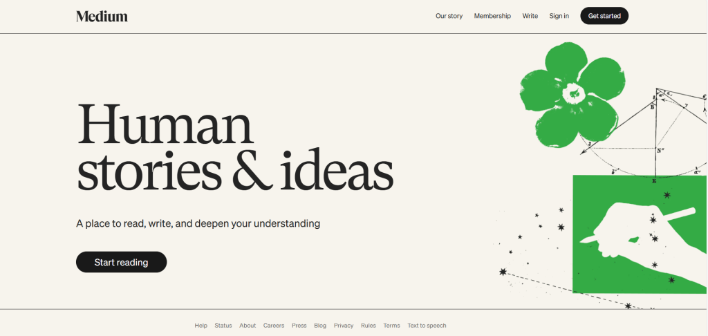
why i like it ?
- Uses Charter (a serif font) for body text very readable, literary feel.
- Clean sans-serif for headings (balance of modern & classic).
- Wide line-height, generous margins, and excellent contrast.
- Optimized for long-form reading — every paragraph feels smooth and comfortable.
2. Apple
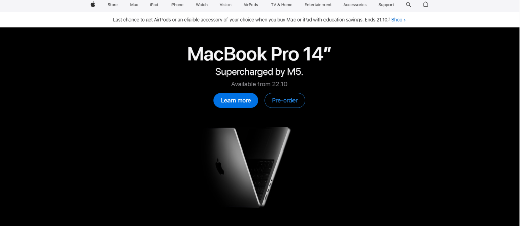
why i like it ?
its only surprise if i dont include apple in a list of beautiful things
- Uses San Francisco, Apple’s custom sans-serif typeface — crisp and consistent across all screens.
- Huge visual hierarchy: large headlines, minimal body text.
- Typography carries brand voice (clean, elegant, confident).
- Responsive design keeps text perfectly spaced on all devices.
and ofcourse you will feel the luxury throught the site
3. Upwork
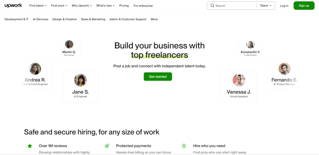
why i like it ?
- The site uses a clean sans-serif typeface in its value-proposition hero section. Large enough to grab attention, but still readable.
- The typography balances impact (for hero headings) with clarity (for body text).
- The difference in typography between the hero / heading zone and the body zone.
- How the font choice supports the brand’s message of modernity and reliability.
- How contrast (size/weight/color) helps highlight calls to action or important messages.