What is this project about ?
This project focused on designing and building a small business website for Alf’s Cycles, a local independent bike shop in Whitstable. My main aim was to create a clear, approachable, and realistic website that reflects the values of a non-corporate, community-based shop and encourages customers to visit the store in person rather than shop online.
Understanding the Brief
From the start, I understood that the website needed to feel local, honest, and human, rather than polished or corporate. Alf’s Cycles is not an online retailer, so my goal wasn’t to push sales through the website. Instead, I wanted to provide information, build trust, and guide users to visit the shop. This influenced many of my design and content decisions, including the tone of the text, the layout, and the use of calls to action.
Design and Visual Decisions
I aimed to keep the overall design clean and simple to ensure usability and clarity. I used plenty of white space so that the content would be easy to read and not feel overwhelming. The brand colour, orange, was used selectively for headings and call-to-action buttons to strengthen the brand identity without distracting from the content.
Typography was also a key focus for me. I created a clear hierarchy by making headings larger and bolder than the body text. This helps users quickly scan the page and understand the structure of the content, while also improving accessibility and readability across different screen sizes.
For images, I wanted them to support the shop’s personality rather than just decorate the page. The hero image sets the tone of cycling culture immediately, while the gallery images help users visualise the shop and its services, reinforcing trust and authenticity.
Content and Tone
from one of prisca’s class i learnt why tone of the content matters.I made sure all written content felt human, friendly, and honest. Instead of using promotional or corporate language, I chose text that reflects how a real local shop would speak to customers. Phrases like “no pressure” and “come and chat with us” were intentionally included to lower barriers and encourage in-person visits.
The services and brand sections focus on reassurance rather than selling, highlighting expertise, experience, and personal advice. This aligns with the brief and supports the idea that bikes are best chosen in person. so it suits the business.
Navigation and User Experience
I knew that clear navigation was essential for a good user experience. I used a simple navigation bar consistently across all pages, and I highlighted the “Contact” call-to-action to make it easy for users to find location information.
Since mobile responsiveness is so important, I implemented a collapsible navigation menu using JavaScript to ensure usability on smaller screens. I also adjusted button sizes, spacing, and typography for mobile so that the interface remains comfortable and uncluttered.wanted to use JS after David’s last few session. so i tried and it works kinda good.
Accessibility and Responsiveness
I built the site using semantic HTML to support accessibility and screen readers. I made sure all images included descriptive alt text, and I carefully considered font sizes and contrast to improve readability. Responsive CSS ensures that the website adapts smoothly across desktop, tablet, and mobile devices, avoiding horizontal scrolling or layout issues.
Reflection and Learning
Through this project, I improved my understanding of how design, content, and technical decisions must work together to meet a brief. I learned the importance of restraint — focusing on what the user actually needs rather than adding unnecessary features. Debugging layout and responsiveness issues also helped me better understand CSS positioning and adopt a mobile-first mindset.
Overall, I believe the final website meets the brief by presenting Alf’s Cycles as a friendly, trustworthy local business. I feel it successfully balances visual design, usability, and realistic content while guiding users toward visiting the shop in person.
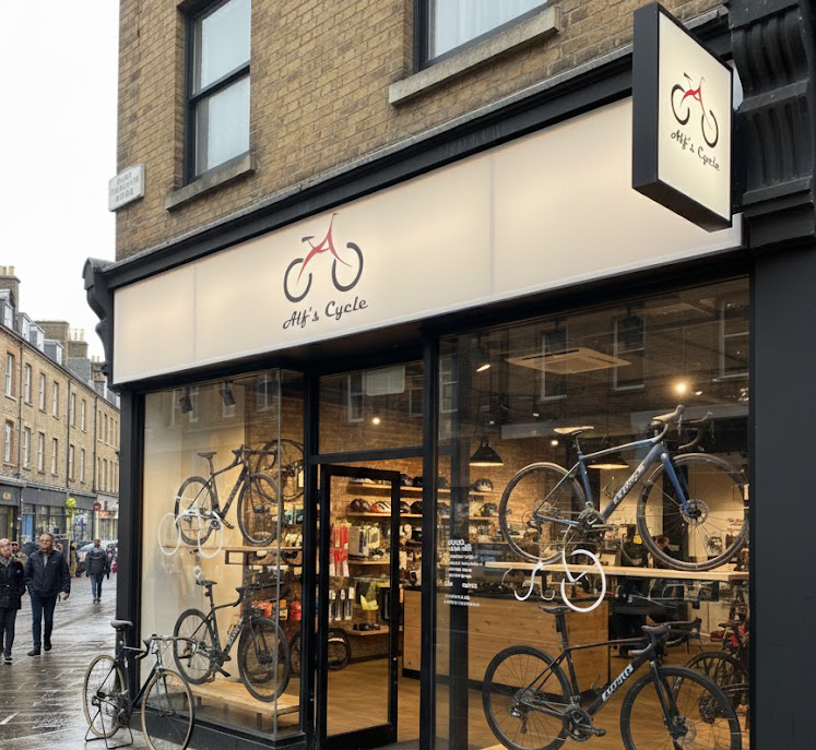
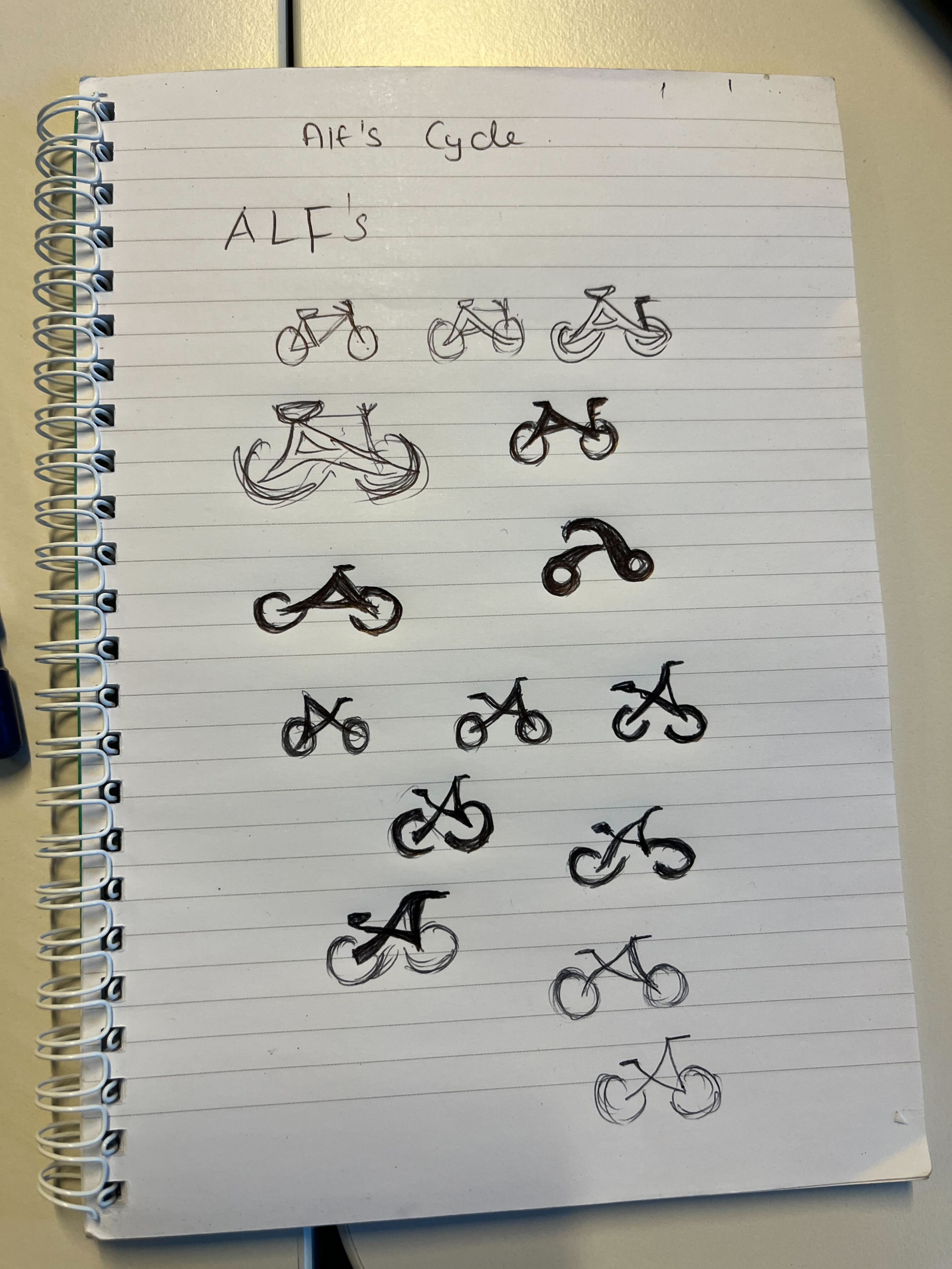
Branding and Logo Design
I spent a significant amount of time developing the logo for Alf’s Cycles, as the business did not have an existing brand identity. I wanted the logo to be simple, memorable and meaningful rather than decorative. The final logo is based around the letter “A”, taken from the name Alf’s, positioned in the centre to create a strong focal point. I then designed two circular forms on either side of the letter to represent bicycle wheels, allowing the logo to subtly read as a bike while remaining typographic.
This approach helped the logo feel both functional and symbolic. By avoiding overly complex illustrations, the logo works well at different sizes and across digital contexts, such as the navigation bar and footer. The combination of letterform and wheel shapes reflects the shop’s practical, no-nonsense personality while clearly communicating its purpose. Designing the logo in this way also allowed the brand to feel local and handcrafted, which aligns with Alf’s Cycles as an independent, non-corporate business.
i feel like i should still work on this project more in future so i can make it more visualy and contet-wise appealing.